Translate

Sunday, April 24, 2022

The Big 5 Natural Causes of Global Warming - part 1: Varying Atlantic Water Transport

This is the transcript for the video 

https://www.youtube.com/watch?v=kQbSplM6o9Y

The Big 5 Natural  Causes of Global Warming -  part 1: Varying Atlantic Water Transport


I previously discussed how CO2 has maintained today’s hospitable climate in the video titled, “How CO2 Saves The Earth: Greenhouse Gases Vital Warming & Cooling Effects”


But as our lower atmosphere saturates with CO2, additional CO2 has much less of an effect today.

The Big 5 natural climate dynamics - when considered together- offer a far better explanation of both regional climate trends and the statistical global warming trend since the end of the little ice age. The first of the Big 5 identifies the effect of varying transport of warm Atlantic waters into the Arctic.

Jonathan Kahl’s analysis of Arctic surveys between 1950 and 1990 & published in the pre-eminent journal Nature, found no rise in arctic air temperatures.


But after the 1990 shift of the Arctic Oscillation, which caused sub-freezing winds from Siberia to blow insulating arctic sea ice out of the Arctic, arctic air temperatures suddenly began warming several times faster than the global average temperature.


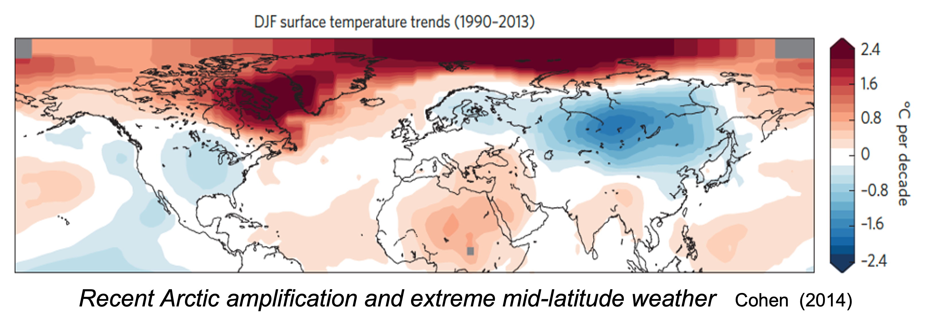
The loss of insulating sea ice increased the ventilation of stored ocean heat, warming the air but cooling the ocean. That warming offset and obscured, the 25-year winter cooling trend in both North America and Eurasia, represented here by the blue colors. Clearly Arctic warming was due regional climate dynamics, not global.

From Danish sea ice records and modern satellite photos, we see two distinct periods with very similar reductions in the extent of arctic sea ice. One during the 1930s and one since 2000. Those 2 periods of reduced sea ice are separated by an intervening 30-year period of increasing sea ice, suggesting sea ice is modulated by a natural oscillation.


The Atlantic Multidecadal Oscillation represents a natural cyclical dynamic where the northern Atlantic waters alternate between becoming warmer than the southern Atlantic and then become cooler.

It cycles approximately every 60 years.


The decades with 0.3 to 0.5 degrees Celsius warmer north Atlantic waters coincide with the decades of reduced Arctic sea ice and rising global temperatures.

The decades between the 1950s to 1990s, when the north Atlantic's temperatures were 0.3 to 0.5 degrees Celsius cooler, Arctic sea ice increased and there was no global warming trend.

As climate scientist Moreno-Chammaro published in 2020, these alternating periods of warmer and cooler north Atlantic temperatures also correlated with changes in the Intertropical Convergence Zone or ITCZ


The ITCZ is a migrating band of rising air, that sailors called the doldrums, which also brings heavy rainfall. Over Asia and Africa the ITCZ follows the sun to the Tropic of Cancer or Tropic of Capricorn according to each hemisphere's summer solstice.

The ITCZ is also the driver of the earth's Hadley Circulation that constantly transports warmth and moisture from the tropics towards the poles.


Where the north and south trade winds converge defines the ITCZ’s position, and determines where the rising branch of moist air of the Hadley Circulation will create a rainy season. Because the OTCZ determines the location of tropical rainy seasons, it leaves strong clues to how its location has changed over centuries and millennia.

Around 30 degrees north and south of the equator, the air moving towards the poles at the top of the atmosphere converges with upper atmospheric winds that are moving back toward the equator. This upper air convergence drives air currents downward to create a quasi-permanent high-pressure region at the surface.

Around 60 degrees north and south, the convergence of opposing surface air currents drives air upwards producing a quasi-permanent low pressure region.

As the ITCZ migrates north and south, so do these inter-connected high and low pressure systems


As illustrated by Zou's 2014 research, during the Little Ice Age as the ITCZ migrated southward, so did its associated pressure systems. Its more southerly location caused warm equatorial currents to be deflected southward by the point of Brazil.

The southward migration of the associated north Atlantic pressure systems also steered warm gulf stream waters more eastward, reducing warm water flows into the Arctic, resulting in cooler temperatures that enabled the greatest Arctic sea ice buildup in 6000 years.

When solar irradiance increased, marking the end of the Little Ice Age, the ITCZ and associated pressure systems all migrated northward.


Now, the more northerly location of the ITCZ guided more warm tropical waters north of the point of Brazil causing more warm water to flow across the equator and feed more warm water into the gulf stream.

Additionally, the northward shifting north Atlantic pressure systems increasingly drove more warm gulf stream waters into the Arctic, which reduced arctic sea ice.

Changes in solar irradiance and sunspot cycles correlate with that migration of the ITCZ. Three sunspot minimums and reduced solar irradiance occurred during the Little Ice Age and correlates with the ITCZ southward migration( illustrated here in blue).

The increasing solar irradiance since the end of the little ice age correlates with the northward migrating ITCZ and our current warming trend.


As the northward migration of the ITCZ resulted in more warm water entering the Arctic, that warm, inflowing Atlantic water circulates around the arctic for 25-30 years at 100 to 900 meter depths.

That warm Atlantic water keeps most of the Barents Sea inside the Arctic Circle free of ice all winter

And warm Atlantic waters circulating along the shallow Eurasian coasts combine with winds from Siberia to push sea ice away from the coast and maintain ice-free polynya during the winter with open waters that further expand during the summer.


The insulating effects of sea ice determines how quickly the arctic ocean will cool and how much heat ventilates and warms the Arctic air.

According to peer-reviewed studies by Ignatius Rigor published in 2002, 3 meter-thick ice can ventilate 5 times more heat (about 10 W/m2) than radiated by society’s added CO2.

Where older ice is replaced by thinner 1-meter thick ice, about 15 times more heat than from CO2 (about 30 W/m2) can ventilate.

And newly forming thin ice can ventilate 350 times more heat than added CO2 (about 700 W/m2)

It is this ventilating Arctic heat that has amplified Arctic and global air temperatures.

As illustrated here by NASA’s National Snow & Ice Data Center,


In summer 1985, over one third of the Arctic ocean was covered by old 3+ meter thick ice (represented here in white) Abundant thick, insulating ice explains why Jonathan Kahl's 1993 analyses found no Arctic warming.

After cold freezing winds began removing that thick ice in 1990, by 2017 less than 5% of the Arctic ocean was covered by old 3+ meter thick ice, and the amount of open water (in dark blue) more than tripled during summer allowing much more stored ocean heat to ventilate

To blame CO2 for the sudden loss of arctic sea ice, which all agreed was caused by the 1990s strong shift in wind direction during a positive phase of the North Atlantic Oscillation, 6 leading advocates of the CO2 warming theory, including NASA’s now chief climate modeler Gavin Schmidt, published in 2002 that rising CO2 was controlling the natural North Atlantic Oscillation,


I quote "four of the five general circulation models show an unambiguously positive Arctic Oscillation and North Atlantic Oscillation response to greenhouse gas forcing, consistent with the hypothesis [their hypothesis] that the observed upward trend in these indices is anthropogenically induced”

But this illustrates how badly Gavin Schmidt's conclusions had been biased by his advocacy, such as his efforts on the so-called RealClimate website that he co-founded with Michael Mann, where he advocated for a hypothetical CO2 driven climate crisis.

In the real world, despite continued rising CO2 concentrations and despite Schmidt's unambiguous modeling results, the North Atlantic Oscillation has been doing the exact opposite. It has been trending more negatively for the past 2 decades.

Oddly, despite this utter modeling failure, Gavin Schmidt was awarded the position of NASA’s GISS director, replacing the prominent climate alarmist James Hansen.


Changes in natural climate dynamics firmly disputes alarmists' claims of a rapidly approaching CO2 driven climate crisis.

1. Increasing arctic temperatures are chiefly caused by ventilating stored heat that warms the air but cools the ocean.

2. The lowest solar irradiance in 100 years (sunpsot cycle 24) suggests further cooling of the North Atlantic.

3. Declining solar irradiance suggests a southward migrating ITCZ causing less northward transport of tropical heat.

4. The coinciding shift of the Atlantic Multidecadal Oscillation further suggests cooler north Atlantic waters entering the Arctic in coming decades, and that would predict that as older Atlantic water circulating in the Arctic for 30 years finally cools, conditions would allow Arctic sea ice to recover.

5. Finally because most climate models and leading climate scientists incorrectly attributed rising CO2 to the North Atlantic Oscillation's shift to its positive phase, their alarmist crisis claims should be viewed with a great amount of skepticism.

So I urge you to consider the effects of natural climate dynamics, and this is just the first of the Big 5 that better explains our current warming trends.

So up next: # 2 of the Big 5 climate dynamics: How shifting jet streams affect global temperatures.

Friday, April 15, 2022

National Geographic’s Misinformation about Forests and Climate Change


National Geographic is at it again! Five years ago, National Geographic published a story and a video of a sickly emaciated polar bear that they fearmongered was the result of climate change. After heavy criticism they admitted they didn’t really know what had affected the bear and, in their attempt to raise “concern” about climate change had gone too when stating "this is what climate change looks like." But that’s how click-bait journalism profits.

Now, they have assembled cherry-picked photos of dying forests that they also blame on climate change to craft a propaganda article “The FUTURE OF FORESTS” with the headlines “HEAT AND DROUGHT ARE KILLING OUR FORESTS…BUT WE CAN LIMIT THE DAMAGE… IF WE CHANGE COURSE NOW.”

Although the article admits “Trees are growing faster” due to rising CO2, and in passing also acknowledged “climate change still poses less of a threat to forests than logging and land clearing”, their intent was to sell fear that “the climate threat is growing fast.” To make the reader believe their hyperbole, they paraded a myriad of unsupported claims that “climate change is killing trees.” That, “forest scientists are increasingly uneasy in the quickening pulse of extreme events—fire, more powerful storms, insect infestations, and, most notably, severe heat and drought.” Throughout the article, National Geographic sprinkles in truth but then hammers their readers with climate change misinformation.

National Geographic mindlessly blamed catastrophic wildfires on climate change-worsened drought, despite all the scientific evidence pointing to the build-up of forest fuels due to poor landscape management. In 2002-2004 some 350 million piñons, New Mexico’s state tree, died across the Southwest due to drought and fire. To National Geographic’s credit they reported on the wildfire in the Jemez Mountains of New Mexico that “From 1650 on, this ponderosa pine forest survived 15 fires—but in the 20th century most fires were suppressed. Fuel built up in the forest and a long, hot drought settled in. A monster blaze in 2011 ravaged 45 square miles in its first night.” “Unprecedented fires eviscerated hundreds of thousands of acres of ponderosa pines.”

But then the bait and switch to fearmonger climate change. They claimed, “the drought was hotter”. “The slight increase in temperature attributable to greenhouse gas emissions was already enough to set the death of New Mexico’s trees in motion.” But it was not a hotter drought. The Palmer Drought Severity Index (PDSI) combines changes in both rainfall and temperature to estimate drought severity. According to data from NOAA and published on the GlobalChange.gov website, the PDSI for current drought conditions in New Mexico are now milder than they had been during Little Ice Age droughts, between 1200 and 1800 AD. (Red represents instrumental data and blue represents reconstructed data from tree rings.)

Likewise, PDSI data for neighboring Utah and Colorado data indicate the western United States is experiencing milder drought conditions than the last 1000 years, as well as similar change in the south-eastern USA.

Nonetheless, eager to add more threatening effects from increased heat and droughts attributed to climate change, National Geographic focused on recent wildfires in Yellowstone claiming, “Yellowstone is part of a global trend”. They reported trees were not returning after fires in the region, quoting one researcher that in Colorado, Idaho, Montana, and Washington, the number of burned sites that didn’t recover jumped from 19 percent before 2000 to 32 percent in the years after. But again, the data does not point to climate change as the cause.

From estimates for the Northern Rockies and Plains (MT, ND, SD, WY, and NE) the Palmer Drought Severity Index (PDSI) for July from 1895–2020, finds the upper Missouri River Basin has been wetter in the recent 15 years while the worst droughts were in the 1930s. That PDSI also correlates with the EPA’s Heatwave Index, showing the worst heatwaves in the 1930s, far exceeding any excessive heat in recent decades.

National Geographic’s misinformation was most repulsive when dramatizing the fires in California’s Sequoia and Kings Canyon National Park. “If any species could withstand climate shifts, you might think it’d be giant sequoias, many of which have stood since the reign of Julius Caesar. Instead, change has come frighteningly fast.” National Geographic then sprinkles in a little truth stating, “Sequoias need low-intensity ground fires to release seeds from their cones and clear soil, so seeds can take root. Their high branches make them unlikely hosts for canopy fires. But in 2020 our history of suppressing fire collided with a rapidly changing climate.” However, again, the PDSI shows California’s drought severity has been milder the last 100 years. Suppressing the frequent moderate fires that had maintained a sequoia-favorable environment for thousands of years was the problem.

According to the National Park Service, the 2020 Castle fire “burned 12 giant sequoia groves in the park, with differing levels of fire severity depending on their fire history and location. Groves on warmer and drier south-facing slopes, and with no recent fire, sustained extensive mortality of large giant sequoias,” such as Homer's Nose grove, shown here. Notice the dense forest consisting of thinner trees that had encroached on the thicker sequoia giants due to fire suppression, providing ladder fuels to reach the sequoia’s canopies. National Geographic featured a similar photo to emphasize “Climate change and fire suppression are fueling bigger wildfires.”

Unlike the National Park Service, National Geographic didn’t show photos of how better forest fuel management had protected the sequoias. The NPS reported, “Other groves, growing on cooler, more moist north-facing slopes or having recent history of fire had more mixed and moderate fire severity or limited fire spread. One example is this healthy Garfield Grove (below), where managers did a prescribed burn in 1985” to mimic the natural fire frequency of the past. (Photo: NPS / Anthony Caprio (taken on a November 2, 2020 aerial survey by helicopter)

National Geographic similarly blamed several other forest declines around the globe on climate change despite knowingly never understanding their real causes. National Geographic reported scientists confessing, “The problem is, we can’t yet quantify the planetwide scope of climate impacts. Satellite data show that Earth’s tree-covered area actually expanded from 1982 to 2016 by 7 percent, an area larger than Mexico. But that doesn’t mean forests are doing fine: The data don’t distinguish between natural forests and industrial tree farms.” “No computer model can yet project how climate will change forests globally—or how their carbon stores will feed back on climate. Earth system models historically haven’t done a good job of capturing this.”

Clearly National Geographic’s authors never really understood forestry or climate history. They were once again just pushing a click-bait piece blaming climate change, “Now fossil fuel emissions spewing from coal plants and tailpipes are rearranging forests in other consequential ways,” concluding with, “Do we want even more of this?” “Stabilizing emissions closer to two degrees or less could limit forest losses in Yellowstone to 15 percent.” “Yellowstone’s forests, like many in the world, will never be the same. But they might be close”

Jim Steele is Director emeritus of San Francisco State University’s Sierra Nevada Field Campus, authored Landscapes and Cycles: An Environmentalist’s Journey to Climate Skepticism and several climate science videos and is a proud member of the CO2 Coalition.

Saturday, March 12, 2022

SEPARATING SCIENCE FROM PSEUDOSCIENCE FOR FLOODS AND EXTREME PRECIPITATION

 This is the transcript for the video

SEPARATING SCIENCE FROM PSEUDOSCIENCE FOR FLOODS AND EXTREME PRECIPITATION


https://www.youtube.com/watch?v=bJ8tYvyye64


Welcome everyone.


This video separates science from the pseudo-science regards floods and extreme precipitation in part 7 of How Pressure Systems Control Climate. Floods are the most frequent of all natural disasters. The deadliest of all recorded floods devastated regions of China in cooler times of the late 1800s and 1930s. But the visible heartache of floods today makes them lucrative click-bait for mainstream media and good optics to push a climate crisis. For example, last year National Public Radio promoted pseudo-science in order to frame floods as a new existential threat.


Level ground, rich soils and easy access to water have enticed people to colonize flood plains for millennia, despite the risk of inevitable catastrophic floods. Building levees was one solution. But by denying a river access to its natural floodplains, levees amplified downstream flows only to re-locate flooding. This video won’t delve into the effects of human levee systems, here I focus on the latest science to establish how much flooding can be expected from natural climate variability. Due to the inevitable natural frequency of floods, by 1920 private insurance companies in America stopped offering flood insurance. 


Unwisely, governments then offered flood insurance that has unintentionally encouraged people to stay on the flood plains, no matter how often they needed to rebuild, and no matter how much wetland ecosystems are lost. As seen here, Florida’s St John’s River lost over 90% of its floodplains to encroaching humanity in 70 years. But observing the environmental damage there are now ongoing efforts to restore as much wetlands as possible. 

With the advent of the satellite era, scientists have been able to construct a much more accurate picture of the earth's precipitation patterns and flood risks from climate change. 

Kevin Trenberth, from the national center for atmospheric research, is an outspoken scientist who has promoted much pseudo-science regards floods, and unfortunately, he's usually the first scientist mainstream media interviews in search of a climate crisis headline. 

He generates pseudo-science by mis-applying the proven Clausius-Clayperon equation, which states a 1-degree Celsius rise in temperature increases the atmosphere's moisture holding capacity by 7%, arguing theoretically that global warming must be increasing rainfall and making floods worse. But while the Clausius-Clayperon equation is verifiable in a laboratory setting. It doesn’t explain global precipitation patterns. 


Nguyen's 2018 satellite-based examination of precipitation shows the average rates of regional precipitation around the globe. The Trade Winds carry moisture evaporated from the relatively cloudless regions represented here in dark blue and concentrate that moisture in the Intertropical Convergence Zone, or ITCZ. The ITCZ is represented here by the darker red colors circumscribing the equator. The ITCZ accounts for about 32% of all global rainfall and the importance of a shifting ITCZ on wet and dry climates was discussed in earlier parts of this series. If global warming has increased evaporation, then the ITCZ would be one of the most sensitive regions to support Trenberth’s proclamations that global warming is causing a climate crisis and more extreme rainfall. 

The Western Pacific Warm Pool is the largest ITCZ region of heavy rainfall, yet in the heart of the warm pool, Indonesia’s elevation differences illustrate how interactions with cold temperatures greatly affect the degree of rainfall. In Indonesia’s lowlands receive 70 to 125 inches of rain fall while Indonesia’s higher and cooler elevations, 2 to 3 times as much rain fall. 


Clearly illustrated here warmer temperatures simply don’t translate to more rainfall, over the Sahara Desert where maximum temperatures average 40 degrees Celsius or 104 Fahrenheit, there is only enough moisture to produce 3 inches of rain each year. In contrast, Dublin Ireland receives over 10 times that amount of rainfall despite a much lower average high temperature of just 15 degrees Celsius or 59 Fahrenheit. 

Clearly atmospheric circulation can trump the Clausius-Clayperon temperature equation. 


Using 33 years of NOAA’S satellite data, Nguyen 2018 also mapped the world's trends in precipitation. Revealing a vast mosaic of increasing and decreasing trends that defies Trenberth’s pseudo-science. The blue areas represent increasing rainfall trends of which only 2.3% of the earth experiences any statistically significant increasing trend. Regions of decreasing precipitation are illustrated by red colors, and cover half the earth, but significant drying covers twice the area of significantly increasing precipitation. To see more clearly where statistically significant changes are happening, Nguyen 2018 produces this map. 


And contrary to Trenberth’s claim that global warming will cause convergence zones of moisture to exhibit increased precipitation, over 95% of the ITCZ region has shown no significant change in 30 years casting serious doubt on the usefulness of either the Clausius-Clayperon equation or global warming average statistic. Likewise, over the USA where extreme precipitation events and floods are quite common, there has been no significantly increasing rainfall. 


In 2011, Michael Dettinger a hydrologist with the US Geological Survey and a Scripps researcher, published this illustration showing the location of weather stations reporting extreme rainfall of 400 mm or 15.8 inches or more of rainfall over 3-day periods spanning the years 1950 to 2008. 

It is well known that most extreme rainfall is largely associated with hurricanes and atmospheric rivers. Accordingly extreme rainfall is observed along the Gulf coast and eastern coast of the USA during the warm months, when and where hurricanes are most impactful. 

Purple dots represent weather stations that have recorded one extreme event in the past 60 years while the blue dots represent locations observing 2 or three extreme events during that time span. 

Atmospheric rivers deliver the extreme rainfall events in California happening mostly during the cooler months of late fall, winter, and early spring. There, a few weather stations have recorded extreme precipitation 6 and 7 times in 60 years. 


The water cycle helps illuminate the source of moisture for various extreme rainfall events. 85% of the earth's moisture evaporation occurs over the ocean, but only 90% of that moisture falls back harmlessly over the ocean. 

The missing 40,000 cubic kilometers of moisture is transported from the oceans to the land each year, but it only accounts for 35% of all the rainfall on land. That's because 65% of continental precipitation is fueled by recycled moisture via evaporation from lakes and wetlands and transpiration by vegetation. 


Because the eastern USA has more wetlands and more forests than the west, it recycles more rainfall, During the warm months of June and July about 60% of the eastern USA’s rainfall is sourced from recycled moisture. So, the eastern USA should also be a sensitive indicator of any global warming induced evaporation and rainfall as suggested by Trenberth. 

But in contrast to Trenberth’s theoretical pseudo-science, Nguyen’s 2018 analyses  show the eastern USA has not experienced any precipitation trends in 30 years. 

KAZEMZADEH (2021)

Depending on what model is used, results often differ. Nevertheless, Kazmzadeh's 2021 satellite analysis, likewise, found no precipitation trends in the eastern USA for the most recent 20 years. 

Using a different time frame, Kazemzadeh did find significant trends in different locations than Nguyen. But still, only 6.1 % of the earth experienced any statistically significant increased precipitation while 6.1% experienced significant decreases. Both studies suggest no change in the supply of moisture for rainfall. And in contrast to Trenberth’s expectation of amplified precipitation where moisture converges, hardly any portion of the ITCZ’s region experiences any increased rainfall. 


In addition to the effect of different starting dates for rainfall trends, how a region's boundary is defined also alters trend analyses. Because state agencies manage water resources, Nguyen 2018 analyzed rainfall trends by political boundaries, resulting in 10 states exhibiting insignificant trends of increasing rainfall while 5 states experienced significant decreasing trends. 

A much different picture arose when defining regions by the more climatically meaningful watershed boundaries. Such analysis then found no regions of the USA experiencing any increase in rainfall, but a significant drying trend in the Colorado river basin. 


So beware, depending on a researcher's agenda, they can cherry-pick the statistics that best suits their narrative. 

If Trenberth’s theoretical proclamations are true that global warming has increased extreme rainfall, it should be reflected in higher flood peaks in the rivers. To test the global warming claims, Gabrielle Villarini examined 50 long-term stream gauge stations, each with a 100+ years of data. As her results here indicate, there has been no increasing trend in peak river flows. The range of flow volumes remained stationary within the bounds of natural variability. 


Nonetheless, there are always outlier years with damaging floods and those years provide the misleading click-bait headlines for the media. The oldest USA station that has monitored the Connecticut river since 1836, had a major flood due to the rains of the march hurricane of 1936. So damaging was that flood, it prompted the USA’s flood control act of 1936. 

Given the lack of any long-term river flow trends, Villarini concluded 

"it is easier to proclaim the demise of stationarity of flood peaks than to prove it through analyses of annual flood peak data." 


The causes of flood damage from hurricanes are more complex and must consider extreme precipitation, coastal surges, coastal landscape changes and broken levees. 

But as expected the devastating flood from hurricane Katrina in 2005 provided Trenberth with the optics to push his single-minded obsession with a climate crisis. Again, he repeated that the Clausius-Clayperon equation dictated worse floods due to an 8% increase in extreme precipitation and a warmer ocean making Katrina stronger. 

But Katrina evolved as local conditions changed, not as a global warming statistic changed. Katrina was a small category 1 hurricane when it first hit Florida, then evolving into a category 5 over the Gulf of Mexico but declining into a category 4 and 3 as it hit the gulf's coastline. 

If we cherry pick Katrina’s time as a category 5 hurricane, it rates as the 12th strongest in 150 years. But there were stronger hurricanes in the 1930s and 50s, contradicting claims that global warming had caused stronger hurricanes. 


The horrific flooding was not due to human effects on climate but, how humans had degraded the landscape around New Orleans. By altering the Mississippi river's course, and draining and urbanizing the wetlands of its floodplains, parts of New Orleans, are now 3 to 5 meters below sea level. Even without a hurricane, any failure of its levees, would produce a devastating flood. A recent study by Dixon in 2005 found New Orleans is still sinking at a rate of 6.4 mm/year and as much as 33 mm/year. Sinking land is a far bigger threat than rising sea level. 


Where hurricanes make landfall is primarily determined by how the winds from the Atlantic subtropical high-pressure system guides the storm. Known as the Bermuda high when centered more towards the USA, the winds more often drive hurricanes into the Gulf of Mexico, relative to times when the high is centered further east and known as the azure high, which causes more hurricanes to pass up the middle of the Atlantic with little coastal impacts. 

This relationship with the High-pressure system is clearly seen by mapping the frequencies of hurricane storm tracks. As represented by the dark red regions, hurricanes more frequently pass harmlessly northward much to the east of the USA. The 2 regions that experience the most landfalling hurricanes are around New Orleans and the east coast from Florida to North Carolina when the high moves westward. 


Climate scientist have been deeply divided on whether or not global warming is causing more Atlantic hurricanes. Using raw data, Trenberth’s ilk point to a rising trend as seen in green. Other scientists argue before the satellite era, many hurricanes went undetected and thus were underestimated unless they came closer to shore. So those scientists adjust the data and find no trend as illustrated by the orange line.


Hurricane landfall data is more robust, and it too finds no increasing trend. 

And accordingly, there is no significant trend in precipitation in the USA where it is most affected by hurricanes. 

High precipitation in every cyclonic storm, whether called hurricanes, extratropical cyclones or atmospheric rivers is primarily due to warm moisture transported poleward from the tropics by the warm conveyor belt As the warm conveyor approaches colder air to the north, it rises and cools, causing moisture to condense and rain out. The rising air of the warm conveyor also induces cold dry air to sink from the upper atmosphere to maintain a mass balance. 


These dynamics of all cyclonic storms are readily seen in satellite photos. The long gold arrow illustrates the path of the warm conveyor that is causing clouds to form as it rises. Also note the faint outline of the USA showing the moisture is being pulled from the tropics south of the Yucatan The dark band paralleling the warm conveyor represents the cold dry air that has descended into the cyclone. 


The earth's more frequent atmospheric rivers transport more moisture poleward than hurricanes, likewise, via their warm conveyor belts, they transport more than 90% of all tropical moisture reaching the mid latitudes. 

Globally about 130 atmospheric rivers occur each year with 20–30-hour lifespans. Disproportionately, California averages 15 a year, explaining why California is such a hot spot for extreme precipitation. Globally there can be 5 or 6 atmospheric rivers happening at any one time, but not all make landfall. 


Like hurricanes, the path of an atmospheric river is determined by the configuration of High- and Low-pressure systems. 

Here an atmospheric river extends poleward from the pacific warm pool With a contracted low-pressure system centered around the Aleutian Islands, the atmospheric river was guided north of San Francisco (the green dot) and into British Columbia on September 21, 2021. 


One month later, the low-pressure system had expanded and moved southward. Along with the high-pressure system to the south the atmospheric river was guided into California. 


San Francisco received over 4 inches of rain in a single day, ranking as the 4th most ever recorded. But we can’t blame global warming More and stronger rainfalls happened in the cooler 1800s. 


The great flood of 1862 was caused by an atmospheric river’s rain on snow event in the sierra Nevada that resulted in the downstream flooding of Sacramento. By studying the amounts of sediments delivered by heavy river flows into the Santa Barbara basin and san Francisco Bay, scientist have identified floods caused by past atmospheric rivers. During the cooler times of the Little Ice Age between 1300 and 1860s ad, California experienced several atmospheric river-induced megafloods. The greatest of all in over 2000 years happened in 1605. 

So why so many mega-floods during the cooler little ice age?


The best explanation suggests as El Ninos and La Ninas and the associated pacific decadal oscillation alter the sea surface temperatures, The pressure systems align accordingly 

Although debated, most researchers have determined that during the Little Ice Age the Pacific Ocean existed mostly in an el Nino-like condition with more rainfall over the eastern pacific due to warmer surface temperatures In combination with more atmospheric rivers initiating from a warmer eastern pacific, the research by Zhou 2019 shows El Nino-like conditions configure the cyclonic low-pressure systems and anticyclonic high-pressure systems to drive more atmospheric rivers into California 


During La Nina-like conditions, the eastern Pacific is cooler and the western pacific is warmer. This promotes more atmospheric rivers beginning in the western pacific warm pool.

In combination with the resulting changes in the pressure systems, more atmospheric rivers are guided northward into British Columbia and California becomes drier. 


During La Ninas the resulting warming of the western pacific warm pool also promotes more atmospheric rivers into the southern hemisphere, One which recently flooded Australia’s Brisbane region. The configuration of pressure systems focused that atmospheric river onto Brisbane and its surrounding regions, bringing a record 24.1 inches of rain in just 3 days 


But that is not the record rainfall for Brisbane’s watershed. 

As has been the case so often, It was during cooler times, that a stronger atmospheric river inundated the region. In 1893, In the nearby town of Crohamhurst a record 35.7 inches of rain fell in just one day. 


So, make no mistake. As experts have warned, megafloods are coming, with the same devastating force as they have in the past. Climate models predict worse atmospheric rivers due to increased evaporation and the atmosphere’s greater moisture capacity from global warming, but satellite data contradicts those claims, making forecasts based on global warming useless. 


And data from the little ice age shows atmospheric rivers are independent of global warming. However, on the good side, forecasting the location of devastating floods maybe more predictable because the path of hurricanes and atmospheric rivers are, modulated by natural oscillations and their effect on observable guiding pressure systems, But despite better weather forecasting, the real worry is people continue to colonize more and more flood plains, putting themselves in harm’s way. 


If you live in a flood plain, cutting your CO2 emissions won't stop the floods. The wisest plan is to move to higher ground or else keep reinforcing your levees.