To be good stewards of the environment we need climate data we can trust. Because organisms always respond to local temperatures, ecologists never use homogenized data because the process obliterates natural variability as I had written about before. Now it is coming to light that much of the "warmest year ever" is the product of a fabricated virtual reality some are calling The Great Temperature Manipulation Scandal because homogenization obliterated warm peaks in the 30s and 40s. I would not have given such blog headlines any more attention than a supermarket tabloid, except for the fact my own research observed the exact same thing. It is so outrageous I would urge you all to demand a congressional investigation.
When I began researching the causes of a bird life collapse at one of my meadows in the Sierra Nevada, I had to examine possible connections between biological competition, parasitism from cowbirds, affects of grazing, landscape changes, the altered hydrology, and climate change. I dismissed climate change because in the Sierra Nevada the maximum temperatures were greatest in the 30s and 40s and that observation held true from Tahoe City to Yosemite to Death Valley. Apparently the Sierra Nevada were not very sensitive to rising CO2. Below is the graph downloaded from the US Historical Climate Network for Yosemite.
 |
| USHCN Maximum Temperatures at Yosemite National Park Later, Peter Meisler, a rabid believer in CO2 caused global warming, who runs a small blog dedicated to smearing all skeptics, began stalking and attacking me in his blog. When he saw my version of Yosemite's temperature trend in my IEEE presentation, his cognitive dissonance was so great he launched a smear campaign suggesting "my" Yosemite trends were a fraud. But that would only be true if the US Historical Climate Network is also fraudulent. Unfortunately based on recent revelations, the USHCN is coming under increasing suspicion due to The Great Temperature Manipulation Scandal! Meisler proved to be just another whacko internet sniper, as Yosemite's trend is nearly identical to my presentation. But I soon realized that graphs of temperature trends I had created for my book in 2011 were being continuously adjusted making them warmer and warmer over a period of just 5 years even though the data had been quality controlled over a decade ago.
For example, I had downloaded Death Valley's maximum temperature data (graph on right, maximum temperature is solid line)in 2010 and published the graph in my book. The new USHCN trend for Death Valley downloaded January 2015 (on left) manipulated a cooling trend into a warming trend.
When I was investigating IPCC's Camille Parmesan's bogus claims that global warming had killed the Eidth's Checkerspot butterfly, I had examined all the USHCN stations in southern California and downloaded USHCN data in 2010. So I was curious if other stations had also been manipulated warmer. Cuyamaca is a high quality weather station that had never moved or change instrumentation, so it should serve as a standard. But for no reason its trends was also manipulated, and manipulated repeatedly from its raw data.
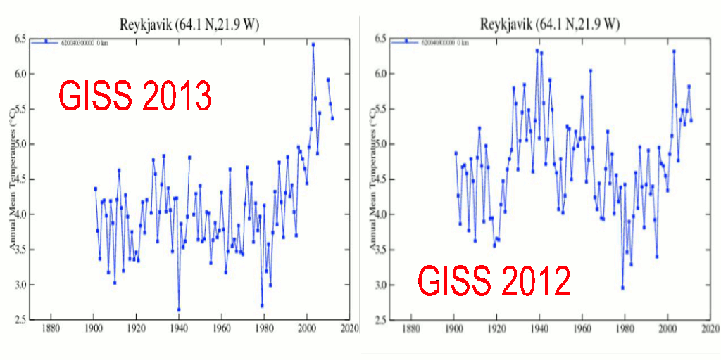
Here's how the Cuyamaca was adjusted since that time and I had to wonder how much of the "warmest year on record" was the result of such data tampering. It didn't take long to find others were observing the same manipulations.
Steve Goddard has posted to his website Real Science the following observations.
For Reykjavik Iceland
Paul Homewood on his blog A Lot of People Don't Know That posted similar manipulations from Paraguay.
|
And the same in Russia
And in Australia
Another independent researcher, Bill Illis, posted this Iceland graph (below) to my blog post at WUWT writing "The top right panel is the quality controlled temperatures from Iceland Met which they insist requires no further adjustment for any station moves, TOBs or polar bears or anything. The second right panel is the temperatures the NCDC reports to the public and the bottom right panel is the adjustment they apply to each year. I mean “reports to the public” is a government agency supplying temperature data to the whole world. 75% of the stations from the NCDC have this same pattern.
Bill suggests that about 75% of the global data has been manipulated in a very similar way, so I suspect we will soon see a growing wealth of evidence that adjusted data we are fed in the headlines are not to be trusted.
To be good stewards of the environment we need data we can trust. Write your congressman and ask for an investigations!


Jim, new to your blog and it is excellent. Thank you for addressing the surface record adjustments. They are indeed diverging from the satellite and weather balloon records, with neither RSS of UAH showing 2014 as anywhere close to 1998.
ReplyDeleteFYI, I live off the 108 near Pinecrest lake at the 5700' level. What are your thoughts on the loopy jet stream and the RRR.
(Thankfully we got about 14'' of snow this last April storm, but many locals are naturally very concerned and some are convinced it is CAGW, no matter how I explain either the Calif drought history, or the fact that NH snow fall is steady to slightly increasing over the past 30 years.)
I would love to hear your thoughts on the Calif water situation as well.