Interview with Jack Spirko
Showing posts with label climate change. Show all posts
Showing posts with label climate change. Show all posts
Tuesday, May 26, 2015
Wednesday, March 25, 2015
Ocean Acidification: Natural Cycles and Ubiquitous Uncertainties
In 2002, Scripps’ esteemed
oceanographer Walter Munk argued for the establishment
of an Ocean Observation System reporting,
“much of the twentieth
century could be called a “century of undersampling” in which “physical charts
of temperature, salinity, nutrients, and currents were so unrealistic that they
could not possibly have been of any use to the biologists.
Similarly, scientists could find experimental support for their favorite theory
no matter what the theory they claimed.” Due to that undersampling MIT’s oceanographer Carl
Wunsch (2006) likewise noted, “Among the more troublesome distortions now
widely accepted, one must include the notion that the ocean circulation is a
simple “conveyor belt” and that the Gulf Stream is in danger of ‘turning off’.”
Another such
favorite theory, mistakenly offered as a fact, speculates we are now witnessing
increasing anthropogenic ocean acidification, despite never determining if
current pH trends lie within the bounds of natural variability. Claims of
acidification are based on an “accepted
scientific paradigm” that “anthropogenic
CO2
is entering
the ocean as a passive thermodynamic response to rising atmospheric CO2.”
Granted when all else is equal, higher atmospheric CO2
concentrations result in more CO2 entering the oceans and declining
pH. But the ever-changing conditions of surface waters exert far more powerful effects. Whether we examine
seasonal, multi-decadal, millennial or glacial/interglacial time frames, ocean
surfaces are rarely in equilibrium with atmospheric CO2. Relative to
atmospheric CO2, seasonal surface water can range up to 60%
oversaturated due to rising acidic deep water. Due to the biological pump, CO2
concentrations can be drawn down, leaving surface waters as much as 60% under‑saturated
(Takahashi
2002). Thus we cannot simply attribute trends in surface water pH to
equilibration with atmospheric CO2. We must first fully account for
natural ocean cycles that raise acidic waters from deeper layers and the biological
responses that pump CO2 back to ocean depths.
[note: in
this essay I use “acidic” in a relative sense. For example, although the pH of
ocean water is 7.8 at 250 meters depth and is technically alkaline, those
waters are “more acidic” relative to the surface pH of 8.1.]
To appreciate the
importance of pH altering dynamics, consider the fact that pure water has a neutral
pH of 7.0. Rainfall quickly equilibrates with atmospheric CO2, and
pH falls to ~5.5. Dark‑water rivers such as the Rio Negro drop to pH 5.1. In
contrast, due to a combination of biological activities and geochemical
buffering, the average pH of ocean surfaces (and some rivers) rises to ~8.1. In
other words, after equilibration with atmospheric CO2, powerful
factors combine to remove 99.8% of all acidifying
hydrogen ions from rainwater. The balance between upwelled acidic waters
versus carbon sequestration and export by the “biological pump” is the key factor maintaining high pH in
oceanic surface waters, and the communities of plankton that operate that pump
undergo changes on seasonal, multidecadal and millennial time scales; changes
we are just beginning to understand.
In Bates 2014, A
Time-Series View of Changing Surface Ocean Chemistry Due to Ocean Uptake of
Anthropogenic CO2 and Ocean Acidification, they simplistically argued declining ocean pH is
“consistent with rising atmospheric CO2”.
But a closer examination of each site used in their synthesis suggests their
anthropogenic attribution is likely misplaced. For example, at the Hawaiian oceanic station known as HOT, based
on 10 samplings a year since 1988, researchers reported a declining pH trend.
But that trend was not consistent
with invasions from atmospheric CO2. An earlier paper (Dore 2009) had observed, “Air-sea
CO2 fluxes, while variable, did not appear to exert an influence on
surface pH variability. For example, low fluxes of CO2 into
the sea from 1998–2002 corresponded with low pH and relatively high fluxes
during 2003–2005 were coincident with high pH; the opposite pattern would be
expected if variability in the atmospheric CO2 invasion was the
primary driver of anomalous DIC accumulation.” (DIC is the abbreviation for Dissolved
Inorganic Carbon referring to the combined components derived
from aqueous CO2, including bicarbonate and carbonate ions.)
Those higher
fluxes of CO2 into the surface likely stimulated a more efficient
biological pump resulting in higher pH.
That rise in pH is consistent with experimental evidence demonstrating CO2
is often a limiting nutrient (Riebesell
2007), and adding CO2 stimulates photosynthesis. That most
photosynthesizing plankton have CO2 concentrating mechanisms
suggests CO2 is often in chronic short supply.
The greatest
concentrations of CO2 upwell from depth to invade surface waters. As
seen below in the illustration by Byrne
2010 from the northern Pacific, the ocean’s pH (thus the store of DIC)
rapidly drops from 8.1 at the surface to 7.3 at 1000 meters depth. Dynamics
such as upwelling bring deeper waters to the surface reducing pH, while
dynamics such as the biological pump shunt carbon back to deeper depths and
raise surface pH. At the risk of
oversimplifying a myriad of complex dynamics, oceans basically undergo a
4-phase cycle that determines the average annual surface pH. Any adjustments to
this cycle will alter trends in pH over decadal to millennial time periods.
 |
| Vertical profile ocean pH |
Phase 1:
Varied rates of upwelling and winter mixing raises acidic water to the sunlit
surface
and lowers pH.
Phase 2:
Specific plankton communities, largely
diatoms respond
quickly to the arrival of
nutrients in the surface waters, and
rapidly sequester and export
carbon back to depth. Phase-2 productivity also generates dissolved and
suspended organic carbon that is transported laterally to other regions. When
community photosynthesis absorbs CO2 faster than respiration
releases it or upwelling injects it, surface pH rises.
Phase 3: As
available nutrients are depleted, diatom populations dwindle and other plankton
communities dominate such as coccolithophores and photosynthesizing
bacteria. Instead of rapidly exporting carbon, this plankton community is
better at retaining and utilizing nutrients. The utilization of suspended and
dissolved organic carbon and increased grazing by populations of zooplankton
increase respiration rates relative to new photosynthesis, so pH declines.
Phase 4: A
“regional equilibrium” is established as accumulated organic carbon from
previous
phases is depleted and new, but lower, levels of productivity are
balanced by community respiration. That balance raises pH. This equilibrium is
fleeting and lasts until a new burst of nutrients reaches sunlit waters. The
supply of nutrients rising to the surface cycles seasonally as well as over
decades, millennia and glacial/interglacial intervals, so that short interval
trends are embedded in much longer trends. This is one reason why computed pH
trends by Bates 2014 statistically explained only a minor portion of pH
variability even after removing seasonal trends.
 |
| Diatoms |
First consider
that oceans store 50 times more CO2 than the atmosphere. A small
change in the rate by which deep acidic water reaches the surface is the major
determinant of surface pH trends. Nutrients, acidity, and density increase with
depth, but not all depths contain a balanced supply of nutrients critical for
photosynthesis. To bring denser water to the surface requires a significant
input of energy that is primarily provided by the winds or tides (Wunsch
2004). Stronger winds generate more upwelling and winter mixing. Thus cycles of oceanic and atmospheric
circulation that strength and weaken winds, raise varied combinations and
concentrations of nutrients to the surface, which accordingly affects the
biological pump and pH.
For example
in temperate oceans, winter cooling of surface waters allows winds and storms
to mix surface waters with CO2 rich waters from as deep as 500
meters. This lowers surface pH, so that relatively insignificant inputs from
atmospheric CO2 are undetectable. (Takahashi
2002, 1993). Several researchers have observed significant correlations
between winter mixing and the North Atlantic Oscillation (Ullman
2009, Steinberg
2012). A positive NAO is associated with stronger westerly winds and also
correlates with a stronger subpolar gyre. Counter-clockwise gyres in the
northern hemisphere increase regional upwelling when they strengthen. So
changes in NAO-driven upwelling cause multi-decadal oscillations in the
plankton communities and pH.
In the
Pacific, El Nino years strengthen the Aleutian Low and the Pacific subpolar
gyre, similarly increasing regional upwelling. In contrast during La Nina
years, gyre upwelling decreases but trade winds speed up and intensify coastal
and equatorial upwelling. The frequency of El Niño’s vs La Niña’s varies over
40 to 60 year cycles of the Pacific Decadal Oscillation. Although periods of
increased upwelling decreases pH, due to undersampling it is not clear how this
extrapolates across the whole Pacific Basin during the 20th century.
Upwelling
also varies on millennial scales. During the Roman Warm Period, Medieval Warm
Period and the Current Warm Period, La Nina-like conditions with stronger trade
winds dominated (Salvatteci 2014)
causing above average upwelling and higher productivity. During cooler periods
like the Dark Ages and Little Ice Age, the Pacific was dominated by El
Nino-like conditions with less upwelling and lower productivity. Claims that
oceans have acidified since the Little Ice Age due to anthropogenic CO2
(Caldeira
2003) may be true, but the uncertainties are huge. It is just as likely
increased upwelling caused more acidic modern oceans, or it is equally possible
that modern oceans are less acidic if increased upwelling stimulated a
biological pump that sequestered and exported enough carbon to offset acidic
upwelling.
Global ocean
acidification is determined by averaging sink regions with out‑gassing source
regions. Opposing regional trends add significant uncertainty when determining
global calculations. As illustrated by the yellows and reds in the Martinez-Boti
(2015) illustration below, there are vast regions where so much DIC is
upwelled, on average the ocean is exhaling CO2. Regions that are net
sources of out-gassing CO2 experience lower pH solely due to
upwelling of ancient waters, and the pH is lower than predicted from simple
equilibration with the atmosphere.
 |
| Oceanic regions of outgassing CO2 sources and CO2 sinks |
Paradoxically, oceans also
experience acidification if weakening winds reduce upwelling. For example due
to changing locations and strength of the InterTropical Convergence Zone (ITCZ),
trade winds over northern Venezuela’s Cariaco Basin undergo decadal and
centennial shifts in strength. When the ITCZ moved south during the Little Ice
Age, upwelling and productivity in the Cariaco Basin declined. At the end of
the LIA, the ITCZ began moving northward and upwelling and productivity
increased (Gutierrez
2009). Recently the ITCZ moved further northward due to more La Niña’s and
the negative Pacific Decadal Oscillation, and regional winds declined.
Consequently researchers reported anomalously shallow seasonal upwelling that
brought more DIC to the surface but fewer critical nutrients that reside at
lower depths. This resulted in decreased productivity and a decrease in diatom
populations. Less productivity and less carbon export did not offset upwelled
DIC, so the regional pH declined (Astor
2013). Despite Astor serving as a co-author, Bates 2014 oddly failed to
mention this pH altering dynamic, choosing to attribute Cariaco’s declining pH
trend to rising anthropogenic CO2.
In contrast
to the Cariaco Basin, a negative
Pacific Decadal Oscillation increases upwelling along the Americas west coast, stimulating the highly
productive/high carbon-export community of phase-2. Upwelled DIC is quickly
sequestered and exported by large single-celled diatoms. With their relatively
heavy siliceous shells, dead diatoms rapidly sink carrying carbon to the sea
floor. Larger zooplankton graze on diatoms and their large fecal pellets and
carcasses also carry carbon rapidly to depth. Diatom blooms along California and Oregon spark increased
krill and anchovy populations, which attract feeding humpback whales from Costa
Rica and seabirds like the Sooty Shearwater from New Zealand, confounding any
attempts accurately measure the carbon budget.
As
illustrated in the Evans et al graph
below, coastal upwelling can over‑saturate the surface waters to 1000 matm, 2.5 times above atmospheric pCO2
(represented by dashed horizontal line). Within weeks the biological response
sequesters and exports that carbon so that concentrations of surface water CO2
fall as low as 200 matm; a
concentration that would still be under-saturated relative to the Little Ice
Age’s atmosphere. Relative to these rapid seasonal changes in pH, fears that
marine organisms cannot adapt quickly enough to the relatively slower changes
wrought by anthropogenic CO2 seem overblown.
 |
| Upwelling and the Biological pump along the Oregon Coast |
Still such
fears filter researchers’ interpretations. Along the west coast of North
America, planktonic sea snails called pteropods, begin life feeding on algal
blooms ignited by seasonal coastal upwelling. As illustrated in scanning
electron micrograph “a”, shown below from (Bednarsek
2014), pteropod shells are heavily dissolved during the first few weeks of
life due to acidic upwelled water. Picture “b” shows a larger more mature shell
with the outer part of the shell experiencing no dissolution. As the snails
matured, either upwelled acidic waters subsided or the snail was transported
seaward to less acidic waters by the same currents that promoted upwelling. The result is pteropod shell
dissolution is a very localized, short duration phenomenon.
Nonetheless
in a study sponsored by NOAA’s Ocean Acidification Program Bednarsek 2014
argued those examples of shell dissolution were caused by anthropogenic carbon
writing, “We estimate that the incidence
of severe pteropod shell dissolution owing to anthropogenic OA has doubled in
near shore habitats since pre-industrial conditions across this region and is
on track to triple by 2050.” But such “conclusions” are unsupported speculation
at best. The study failed to determine if upwelled waters were any more acidic
now than during any other seasonal or La Nina upwelling event. Most studies
suggest upwelling declined during the Little Ice Age, and the resumption of
stronger upwelling is the result of a natural cycle. But Bednarsek (2014) simply used a formula
equilibrating past and present atmospheric CO2 to compute surface water
pH. But such methodology is meaningless. No net CO2 diffusion from
the atmosphere to surface waters occurs when upwelling has oversaturated
surface pCO2, and as shown in the Evans et al graph, due to the
biological pump surface waters remained undersaturated relative to both current
and LIA atmospheric CO2. Shame on those NOAA scientists for such
biased interpretations.
 |
| Dissolution of pteropod shells from Bednarsek 2014 |
On all time frames, when upwelling
subsides and nutrients and carbon become scarce, diatom populations dwindle and
oceans transition to Phase 3. Coccolithophore and bacterial communities that
were relatively minor constituents, begin to dominate. Smaller bacteria remain
suspended in the surface layers and export much less carbon. Grazing on
increasingly abundant bacteria and accumulated organic carbon, promotes greater
zooplankton populations. As a
result, community respiration rates increase, and higher CO2
concentrations lower surface pH.
 |
| Coccolithophores |
Coccolithophores are large single-celled alga
encased by several ornate calcium-carbonate “coccoliths”, so that sinking dead
individuals do export carbon relatively quickly. However the construction of coccoliths
metabolically increases surface pCO2, lowers pH and counteracts the “biological pump”. When calcium combines
with carbonate ions to form coccoliths, the reaction releases acidifying CO2.
Likewise the growth of pteropods’ calcium carbonate shells also increases CO2.
It seems paradoxical that one of the greatest fears of ocean acidification is
the dissolution of carbonate shells, yet the very process of creating those
shells increases acidification and lowers surface alkalinity.
Several researchers
suggest coccolith formation evolved to provide much needed CO2 for
photosynthesis in under-saturated waters. Experimental evidence reveals higher
concentrations of CO2 results in lower rates of coccolith formation
but proponents of worrisome acidification argue this is evidence of
acidification’s deleterious effects. However the same response would be
expected if the rate of coccolith formation responds to the available supply of
CO2 required for photosynthesis. Furthermore if they are so
vulnerable to acidification, how did coccolithophores evolve and survive over
200 million years ago, when atmospheric CO2 was at least 2 to 3
times higher than today?
Without copious supplies of nutrients
from upwelling, productivity in subtropical gyres is much lower and diatoms
constitute a minor component of that plankton community. But they still undergo
cyclic changes. In the Atlantic, Steinberg (2012) describes a 113% decrease in
diatoms between 1990 and 2007 in contrast to stable coccolithophore populations
and a rapidly increasing community of photosynthesizing bacteria. In turn
rapidly increasing communities of small zooplankton graze on the bacteria
resulting in increased community respiration rates. Three sites from
Bates 2014 are located in subtropical gyres: HOT near Hawaii, BATS near the
Bermuda and ESTOC near the Canary Islands. And all three are exhibiting these
classic phase-3 patterns with increasing respiration rates (Lomas 2010,
Gonzalez-Davila
2003, Peligri
2005, Steinberg
2012), which accounts for declining pH trends. As shown
by Steinberg 2012, those trends are significantly correlated
with multi-decadal climate indices – the North Atlantic Oscillation plus three
different Pacific Ocean climate indices”.
Global pH decreased when oceans
transitioned from the Last Glacial Maximum (LGM) to the
current interglacial Teleconnections between the Atlantic and Pacific have been
confirmed as warm
periods in the Greenland ice core correlate with periods of extended periods of
upwelling along the California coast (Ortiz 2005). Recent
research also links simultaneous multi‑millennial cycles of upwelling and
higher productivity in the sub‑Antarctic Atlantic and equatorial Pacific. Most
research suggests that at the end of the LGM, Antarctic began to warm followed
by a rise in atmospheric CO2. Although the precise mechanism of CO2
out‑gassing during the deglacial period has been under debate, there is a
growing consensus that circulation changes caused aged waters rich in nutrients
to upwell in subpolar Antarctic waters. Via oceanic tunneling, those deep
Antarctic waters also upwelled in the equatorial eastern Pacific. Using
foraminifera proxy data, the graphic below from Martinez-Boti
(2015) shows periodic upwelling of subpolar Antarctic waters (on the left in
blue) caused regional pH to decline from the LGM maximum of 8.4 to about 8.1 at
the beginning of the Holocene. Due to the biological pump and/or reduced
upwelling during the early and mid Holocene, pH rises and bounces between 8.25
and 8.15.
Based on CO2 concentrations
determined from Antarctic ice cores, Martinez‑Boti also constructed a green
“Equilibrium pH” trend indicating the surface pH if it had simply equilibrated
with atmospheric CO2.
For most of the past 20,000 years, surface waters were not in
atmospheric equilibrium and more acidic, so those regional oceans were
typically a source of out‑gassing CO2. The graphs on the right (in
red) show the same pattern for the equatorial eastern Pacific but with data
that extends further into the LGM.
 |
| Ocane pH variability over pst 20,000 years from Martinez‑Boti 2015 |
Calvo 2011 examined
ocean sediments to determine the strength of upwelling versus the biological
pump plus the relationship between diatoms and coccolithophores over the past
40,000 years. Their research found lower productivity during the LGM and lower
diatom abundance relative to coccolithopheres. As upwelling increased around
20,000 years ago so did ocean productivity and the proportion of diatoms. They
concluded upwelling enhanced the biological pump but it was “not sufficient to
counteract the return to the atmosphere of large amounts of CO2 delivered by the oceans
through an enhanced ventilation of deep water.”
 |
| Ratio of Diatoms to Coccolithophores from Calvo 2011 |
Finally examining
sediments in the eastern equatorial Pacific, Carbacos 2014 found
“a clear prevalence of dominant La Niña-like conditions during the early
Holocene, with an intense upwelling and high primary productivity.” High levels
of productivity persisted through the Holocene Optimum until productivity
dramatically declined around 5,500 years ago. Since that time Carbacos 2014
reports, “An alternation between El Niño-like and La Niña-like dominant
conditions occurred during the late Holocene, characterized by a clear trend
toward prevailing El Niño-like conditions, with a low primary productivity.”
During the past 5,000 years, that lower productivity coincided with increased
dominance of coccolithophores and declining proportions of diatoms. That
suggests the oceans have been in a phase-3 multi-millennial decline in pH
superimposed on multidecadal cycles driven by the Pacific Decadal and Atlantic
Multidecadal Oscillations.
It is also worth noting,
as seen in the graph below, throughout the Holocene changes in atmospheric CO2
did not correlate with temperature. However atmospheric CO2 did
track changing plankton communities. During the early and late Holocene,
atmospheric CO2 concentrations were relatively low and stable during
periods of high productivity with higher ratios of diatoms. When ocean
productivity crashed overall around 5,000 years ago, the proportion of CO2
producing coccolithophores increased and atmospheric CO2 likewise increased
by about 20 matm. A similar annual increase in CO2
has been observed in modern oceans and similarly attributed to increased
proportions of coccolithophores (Bates
1996).
So where are the oceans
headed? If history repeats itself, declining solar insolation will result in
less upwelling, lower productivity, a reduced biological pump and higher pH. Or
perhaps higher levels of atmospheric CO2 will increase productivity
as observed in several experiments, or perhaps rising CO2 will cause
a deleterious decline in pH? The
ubiquitous uncertainties from the current undersampling of oceans allows anyone
to “find experimental support for their favorite theory no matter what the
theory they claimed.” But I can say for sure, I would not trust any predictions
that failed to account for changes in upwelling and the various responses of
the biological pump.
 |
| Contrasting Holocene Temperatures and Atmospheric CO2 |
Wednesday, February 4, 2015
Climate Horror Stories That Wont Die: The Case of the Pika (Stewart, 2015)
 |
| pika |
Because
most people can’t fathom how 0.8 degrees of warming over a century can be
lethal compared to far greater changes on a daily and seasonal basis, advocates
of CO2 warming have littered the media and scientific literature with
apocryphal stories statistically linking cherry-picked data with that small
temperature rise and suggest wide spread future extinctions (i.e. Polar
Bears, Walrus,
Emperor
Penguins, Edith
Checkerspot, Moose,
Golden
Toad ). Pikas are another species that have been repeatedly targeted as an
icon of impending climate doom. Pikas, or boulder bunnies, inhabit talus slopes
(boulder fields) throughout western North America’s mountainous regions. Some
suggest warming has been driving pikas up the mountain slopes, and they will
soon be driven over the edge into the extinction abyss.
The
doomsday stories of the pikas’ “impending extinction” began with a few
contentious papers by Dr. Erik Beever. He re-surveyed a small subset of
Nevada’s pika populations and reported 28%
(7 of 25) of pika territories,
which had been occupied at the beginning of the 20th century, were
now vacant. He suggested those 7 populations had gone extinct possibly due to
climate change. That claim was then trumpeted by groups like the National
Wildlife Federation with articles like “No
Room at the Top.”
As they
had done for polar bears and penguins, the Center of Biological Diversity argued
climate change was threatening species with extinction and sued for pikas to be listed as federally endangered once, and as
California endangered twice. The CBD alarmingly exaggerated Beever’s small
survey to falsely report, “We've already lost almost half of the pikas that
once inhabited the Great Basin.” But to the credit of official wildlife
experts, they rejected those lawsuits due to insufficient evidence. Dismayed
that bad science had been rejected, the CBD called Obama a denier and Joe Romm bemoaned,
“So
long pika, we hardly knew ya.”
Now once
again, dubious science is pushing pikas as another canary in the climate coal
mine. Although the evidence has not supported the pika’s demise, Stewart (2015)
constructed a model that would and published their projections in Revisiting
The Past To Foretell The Future: Summer Temperature And Habitat Area Predict
Pika Extirpations In California. These researchers predict “that
by 2070 pikas will be extirpated from “39% to 88%” of California’s historical
sites.
And once again the media
is hyping that pikas are being pushed up the mountains to their doom.
In
contrast to the hype, Dr. Andrew Smith, the International Union for the
Conservation of Nature pika expert, has testified that pikas are thriving in
California and should not be listed.
Although an avid defender of the Endangered Species Act, he argued that
incorrectly listing the pika as endangered (see
his letter here) would only subject the ESA to greater criticism and
denigrate conservation science.
Due to possible climate change concerns, the US Forest
Service was obligated to extensively survey pika habitat throughout the national
forests of the Sierra Nevada and the Great Basin. Supporting Dr. Smith’s views,
in 2010 they too reported
thriving pikas. Overall, only 6% of observed pika territories were vacant. Due
to the lack of connectivity with other pika territories, when a pika dies the
smaller more isolated territories suffer longer periods of vacancy.
Accordingly, the USFS reported that vacancy rates increased as surveys moved
from the Sierra Nevada with its large interconnected talus slopes to more
isolated habitat in the Great Basin. In the Sierra Nevada the vacancy rate was
just 2%, in the southwestern Great Basin vacancies increased to 17%, and vacancies
were highest, 50%, in more isolated habitat of the central Great Basin ranges. The
larger percentage of unoccupied sites east of the Sierra Nevada crest was typically
due to the greater difficulty of finding and re‑colonizing relatively small and
isolated habitat.
USFS surveys provided more damning evidence that would
lead to rejecting the CBD’s lawsuits. The benchmark for wildlife abundance and
distribution in California had been Joseph Grinnell’s surveys from the early
1900s. Contrary to global warming theory, the USFS survey found many new active
pika colonies several hundred meters
lower than Grinnell had documented. In total, 19% of the currently known populations are at lower elevations than
ever documented by any study during the cooler 1900s. Further north in the
Columbia River Gorge, another independent
researcher also found pikas at much lower elevations, surviving at
temperatures much higher than the models had predicted.
Beever’s
2011 paper tried to counter those findings by arguing there was a nearly “five-fold increase in the rate of local
extinctions and an 11-fold increase in the rate of upslope range retraction
during the last ten years.” But Beever had badly manipulated his data. Surveying
his 25 sites, he too had found 10 examples where pikas now inhabited lower
elevations than previously documented. But he
decided not to use those observations in his calculations. He, the editors
and peer-reviewers unapologetically published his biased calculations to create
his “11-fold increase in the rate of
upslope range retraction”. Beever defended this statistical blasphemy by
arguing pikas had likely always lived at those lower elevations, but had
escaped detection by earlier observers (the equivalent of climate science
infilling). Perhaps. It was possible. But by eliminating all new observations
of pikas at warmer, lower elevations, he guaranteed
their statistical upslope retreat.
Here’s
an example of his calculations:
At Cougar Peak, a 1925 record documented the lowest elevation that pikas
had inhabited was 2416 meters.
Beever’s more recent surveys detected pikas living even lower on Cougar Peak at
2073 meters in the late 1990s, and at 2222 metes in follow‑up surveys in 2003. Despite the fact that recent
observations were all lower than 1925 by about 200 meters, Beever ignored the
historical record. He simply subtracted the 1990s elevation from the 2003
elevation, to report climate had pushed pikas 149 meters higher. Furthermore,
the Cougar Peak site was one of the sites Beever had initially reported as
extinct. Follow-up surveys found a
robust population.
Vacant pika territories are natural and to be expected.
Pika are very territorial and each year they drive their young away. Because
pika live no longer than 7 years, (averaging 3 to 4 years in the wild), there
is constant turnover at each site. A site remains vacant until a young pika,
driven from another territory, randomly scampers into that vacancy and claims
ownership. Without knowing how often a talus pile alternates between occupied
and vacant, simply reporting observations of a vacant site tells us nothing
about 1) why it is vacant, 2)
when it was vacated, and 3) if it will soon be recolonized. Unfortunately
vacancies have been misleadingly called extinctions. To illustrate, in the most
recent paper by Stewart, his team initially found 15 vacancies, but a re‑survey
the following year, found that 5 of those sites were now re‑colonized, a 33%
reduction in “extinct locations” in just one year.
Re‑colonization has similarly undermined other classic
doomsday stories. Parmesan’s iconic 1996 paper reported global warming had
increased extinctions for the Edith’s Checkerspot butterfly, but most of those
extinct colonies in the Sierra Nevada have now been re‑colonized. Unfortunately
the re‑colonization information was never published. (read here
and here).
The IUCN’s Dr. Andrew Smith is the only researcher with
results from long term pika monitoring that actually provides insight into the
natural frequency of “extinction” and re‑colonization.
 |
| Pika on Bodie ore piles |
In California’s abandoned desert mining town of Bodie,
pika have colonized discarded ore piles. Dr. Smith tracked the vacancy rates of
76 ore piles from 1972 to 2009. As expected, during those 37 years Smith
observed 107
local extinctions, balanced by 106 re-colonizations. Like pika habitat
elsewhere in the Great Basin, on average 30% of the ore piles were unoccupied
at any given time, but that vacancy rate was highly variable. Some years the
vacancy rate was as high as 52%, and other years as low as 11% (see chart
below). In his first survey in 1972, Smith found that 82.3% of the ore piles
were occupied by pika. In 2009, pika again occupied 82.8% of their possible
sites. Coincidentally Stewart (2015) found 85% (57/67) of his re-surveyed sites
are now occupied. Without accounting for such a wide range of variability, the
percentage of vacant territories tells us precious little about any climate
effects. But in contrast to Smith’s analysis, Stewart presented vacant
territories as evidence of global warming caused “extinctions”.
 |
| Pika Colonizaton and Extinctions at Bodie |
Although Smith’s research establishes a natural frequency
of vacancy rates, it still doesn’t tell us why a site became vacant. In
Beever’s 2003 paper, the seven “extinct” sites he attributed to climate change
had other more plausible explanations. One site had half of the talus removed
for road maintenance, another site had become a dump site, and a third site had
scattered shotgun shells throughout the talus.
Like rabbits, and a truly endangered species of pika in
China, pikas have been hunted and poisoned because they compete with livestock
for vegetation. All of Beever’s extinct
sites were heavily grazed. Furthermore pikas do not hibernate. They
create hay piles to sustain them through the winter. Any significant loss of
vegetation will likely cause pikas to abandon their talus. Although studies
have reported significant effects from grazing competition, Stewart (2015) did
not include grazing as a variable in his climate change model.
Stewart (2015) created a model that only included 1) area of talus and 2) summer mean temperature as the
determinants of local pika extinctions. Assuming that model represents reality,
they then argued that according to projected warming from CO2 driven models,
pika will become increasingly “extirpated from 39% to 88% of these historical sites”.
But talus area is the more critical variable, and the
average summer temperature is highly questionable. Larger talus areas sustain
more pika territories, and provide protection for dispersing young looking for
vacancies. With more adjacent territories, there are more young pika who can
immediately occupy any abandoned territory. In contrast the smallest talus
areas, often sustaining just a single territory, are islands that lack
connectivity to other territories. Vacant territories must wait to be randomly
colonized by dispersing young from some distance talus. As the distance between
isolated territories increases it is less likely that randomly dispersing young
will re‑colonize a vacated territory. But the degree of connectivity was also
never considered in Stewart’s model. As seen in his diagram below (I added the
red lines for reference), the vacancies can be readily explained just by the
talus area and random dispersal.
 |
| Stewart 2015 pika model |
If the size of the talus area had been modeled as the only predictor of pika vacancies, any
large talus area, (areas above the upper red line), would correctly predict
full occupancy, accounting for 31% of the sites (20 of 67), regardless of
temperature. Small talus area (areas below the lower red line) would correctly
account for 70% of the vacancies (7 of 10 vacancies) regardless of temperature.
In talus of intermediate areas, only 7% of the sites were vacant (3 of 39)
which is close to the overall 6% finding of the USFS surveys. That 7% vacancy
rate is easily accounted for by random extinction/colonization events, and the
percentage is far better than vacancy rates Dr. Smith reported for Bodie’s ore
piles.
The higher temperatures reported at the 3 vacancies with
intermediate talus areas may have been the result of a more barren dry
landscape typical of the eastside of the Sierra Nevada. If so, lack of food,
not higher temperatures may be the critical factor. Stewart never asks if the
vacancies are due to higher temperatures, less reliable vegetation, or distance
from other territories. Stewart’s model statistically linked higher temperatures
to pika vacancies, but that link depends on what sites he includes or omits in
his database.
Beever’s data had similarly suggested higher temperatures
were killing pika, but his analysis excluded data from nearby populations thriving
at warmer and lower elevations just 93 miles away from 71% of Beever’s extinct
sites. At Lava Beds pika were flourishing at an average elevation 900 feet
lower than the average elevation of three nearby extinct sites. Temperatures at
Lava Beds also averaged an additional 3.6°F higher, and precipitation was 24%
less. But Beever analyzed
those sites separately. Likewise Stewart was clearly more interested in a
connection to global warming. In his introduction he speculated, “climate
change forces range contractions, species
may effectively be ‘pushed off’ the tops of mountains by warming climate.”
He also referenced Parmesan’s
bad climate science connection for support. To create a link to global
warming, Stewart needed to use average
summer temperature as the other model variable.
During high temperatures, heat-sensitive pika will seek
refuge beneath the cooler talus. However Stewart argues such behavior reduces
critical foraging time and thus possibly reduces winter survival. Perhaps.
During extreme warm days, pika are known to become crepuscular, restricting
their foraging to the twilight hours. However if that is the key mechanism, then
using the average temperature is simply wrong. The average temperature is
amplified by minimum temperatures of the early morning when overheating is not
a problem. If Stewart was sincerely concerned about induced heat stress, then
the correct metric would be the afternoon maximum temperatures. But maximums
were not even considered in Stewart’s choice of models.
Not considering maximum temperatures would seem shamefully
negligent, but Stewart was aware that other studies had already determined no
correlation with maximum temperatures. Stewart referenced Beever (2010)
who wrote, ““Although pikas have been shown to perish quickly when
experimentally subjected to high temperatures, our metric of acute heat stress was the poorest predictor
of pika extirpations.” Because maximum temperatures had revealed no acute
heat stress, Beever adopted the term “chronic heat stress” which was just a
more alarming way to say the average temperature. But even using average temperature, Beever still concluded, “Climate change metrics were by far the poorest
predictor of pika extirpation.” Stewart’s own data supported
the conclusion that climate metrics provided poor explanatory power.
Stewart also cherry-picked a start date to argue,
“documented 1°C increases in California-wide summer temperature over the past
century, strongly suggest that pikas have experienced climate-mediated range
contraction in California over the past century.” However if one examines the
data Stewart links to for northeastern California, where most of their
“extinctions” were observed, recent summer maximum temperatures have not
exceeded the 1920s and 30s. If pika extinctions were truly “climate-mediated”,
then the high temperatures of the 20s and 30s should have been the main driver.
Furthermore during that 20s and 30s, pika experienced the most rapid
temperature increases of about 2°C (4°F) in just 3 decades.
| Northeast California Maximum Temperatures |
Stewart made one more feeble attempt to justify using
average summer temperatures. He reported that a 2005 paper by Grayson
revealed pika have been forced to move ever upwards as climate warmed
throughout the Holocene. (See graph below) But Stewart seems unaware that he
damaged is own argument. Several
studies, using proxies and models, have shown the Great Basin was warmer
during the Middle Holocene by 1 to 2.5°C. Using Stewart’s logic, as global
warming approaches temperatures seen in the mid Holocene, pika should descend
to lower elevations.
Although summer temperature data has very little
predictive power regards pika biology, it was Stewart’s only link to CO2
climate models. Using that dubious link to summer temperatures, he projects
impending climate doom and widespread pika extinctions. But if Stewart was
truly concerned about preserving pikas, instead of preserving CO2 theory, then
all the data suggests small talus areas that are subjected to grazing are the
relevant concern. To protect the pikas’ forage, simply fencing off livestock
from the edge of those small talus slopes would be a simple affordable
solution. Stewart’s own data also suggests, along with the USFS surveys, that wherever there is large talus
area, there has been nothing to suggest imminent extinctions. So why does the
pikas’ climate change extinction story persist?
 |
| Grayson's depiction of elevations of pika habitat in the Holocene |
Tuesday, January 27, 2015
My interview with Heartland's Dr. H. Sterling Burnett
Link to Janurary 27, 2015 Podcast
interview with Jim Steele: An Environmentalist's Journey to Climate Skepticism
Monday, December 15, 2014
Why Vanishing Ice Is Likely All Natural?
A list of reviewed papers used for this presentation available at http://landscapesandcycles.net/shrinkingice.html
 |
| Mount Kilimanjaro |
If we are to truly prepare for the dangers of climate change and build more resilient environments, we must first understand natural climate change. Unfortunately due to the narrow focus on rising CO2, the public remains ill-informed and fearful about the causes retreating ice. Africa’s Mount Kilimanjaro and America’s Glacier National Park are 2 iconic examples of failed climate interpretations. For example, Al Gore’s “Inconvenient Truth” suggested warmth from rising CO2 had been melting Kilmanjaro’s glaciers. In truth, instrumental data revealed local temperatures have never risen above the freezing point. In 2004, Dr. Geoff Jenkins, Head of the Climate Prediction Programme at England’s Hadley Centre, was prompted by the evidence of no warming, to email the IPCC’s Phil Jones and ask and I quote “would you agree that there is no convincing evidence for Kilimanjaro glacier melt being due to recent warming (let alone man-made warming)?” Yet due to the politicization of climate science, Al Gore shared the Nobel Prize despite perpetuating the global warming myth of Kilimanjaro.
Glacier experts from the University of Innsbruk published and I quote, “The near extinction of the plateau ice in modern times is controlled by the absence of sustained regional wet periods rather than changes in local air temperature on the peak of Kilimanjaro.” Changing patterns of precipitation were recorded in the water level of nearby Lake Naivasha. As researchers documented in this graph, the region had experienced increasing precipitation during the Little Ice Age, followed by a sharp drying trend that began in the late 1700s, which triggered Kilimanjaro’s retreat long before CO2 ever reached significant concentrations.
Ice structures such as these penitentes, are commonly seen in many high elevation glaciers, and help scientists determine if retreating ice was caused by below freezing sublimation, or melting from warmer air. Over decades, sublimation creates sharp features at the border between sunlight and shade. In contrast, any melting from warm air temperatures oozes across the icy surface destroying those sharp features in a matter of days. So the presence of sharp-angled features like these penitentes, are excellent long term indicators of dry and below freezing temperatures.
 |
| Penitentes |
Over 30 years ago I visited Glacier National Park, home of the 2nd iconic example of misrepresented glacier retreat. After thousands of years with less ice, the park’s glaciers grew to their maximum extent during the Little Ice Age. Then they began retreating around 1850. Although the media now hypes the park’s disappearing glaciers as evidence of CO2 warming, the greatest retreats happened long before CO2 could exert any possible effect. In 1913 the park’s largest glacier, the Sperry Glacier was nearly 500 feet thick at a point that would soon become its 1946 terminal edge. By 1936 that thickness had dwindled by 80%. That rapid retreat prompted scientists 70 years ago to predict a natural disappearance of the park’s glaciers.
As seen here, the contrast between the early and late 20th century retreat is striking. Between 1913 and 1945 the rate of retreat for the Sperry glacier was 10 times faster [due to drought] than rate of retreat since 1979. If rising CO2 has been the driver of recent melting, we would expect an increasingly faster rate of retreat, not slower! If we are to prepare for changes caused by melting ice, we must view our vanishing ice from a perspective of centuries and millennia, and tht perspective insists that we understand natural climate change.

There is an abundance of evidence demonstrating that relative to today, far less ice covered the globe during the last 10,000 years, a period known as theHolocene.[i.e. here and here) Far less ice despite much lower CO2 concentrations.
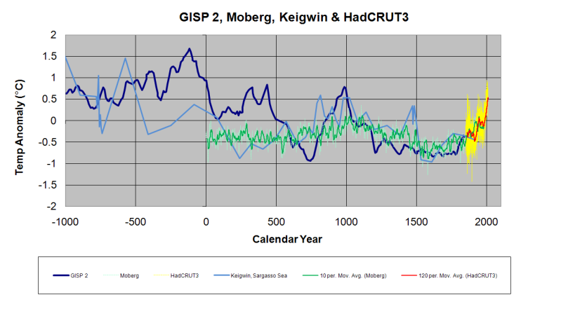
Likewise, although most of today’s average global temperature has been driven by heat ventilating from the Arctic Ocean, as visualized in this NASA graphic, Arctic temperatures were also far warmer during most of the Holocene. Based on changes in tree line, pollen samples and ocean sediments, scientists estimate Arctic air temperatures during the mid Holocene averaged 2 to 7°C higher than today.
This ice core data from Greenland, exemplifies the Holocene’s changing temperature patterns common for most of the Arctic. But it is a pattern that also corresponds to climate change in many other regions across the globe. After the last Ice Age ended, the period of warmer temperatures between 9,000 and 4,000 years ago has been dubbed the Holocene Optimum. During that time, remnant glaciers from the Ice Age retreated and shrank to sizes far smaller than we witness today. All of Norway’s glaciers completely disappeared at least once, and Greenland’s greatest glaciers, like the Jakobshavn, remained much further inland than now observed. Like many northern glaciers, Jakobshavn had only recently advanced past its present terminus during the unprecedented cold of the Little Ice Age.

 |
| Greenland GISP2 Holocene Temperature data vs CO2 trend |
From whale bones, Arctic driftwood, and patterns of Arctic shoreline erosion,we also know that during the Holocene, Arctic summer sea ice retreated 1000 kilometers further north than seen today. Treelines advanced to their greatest northern limits, reaching Arctic Ocean shores 9000 years ago, hundreds of kilometers further north than their current limits.
The paleo-eskimos, or Tuniit, colonized the Arctic’s shoreline about 5000 years ago. They hunted Musk Ox and Caribou with bow and arrow. They lived in tents and heated those tents with Wood. Archaeologists studying Tuniit colonization of Arctic shores, reported periodic abandonment and occupation that corresponded with periods when summer sea surface temperatures bounced between 2–4° cooler and 6°C Warmer than present. Likewise, concentrations of Arctic summer sea ice ranged from 2 months more sea ice to 4 months more open water.
Changes in insolation due to the sun’s orbital cycles, or Milankovitch cycles, correspond with the recent 100,000-year cycles of past major ice ages. We are currently in another warm peak. The Milankovitch orbital cycles also predicted the current cooling trend that began about 4000 years ago. However warm spikes due to high solar output punctuated this cooling trend roughly every thousand years. The unprecedented Holocene glacier growth during the Little Ice Age occurred when solar output was extremely low.
 |
| Past 300 years of solar flux |
In this graph depicting 300+ years of solar flux, the earth warmed as we ascended from the Little Ice Age. Our recent warm spike coincides with high solar flux. However, recently solar output has again retreated, approaching Little Ice Age levels, and correlates with the increasing frequency of cold winters. The next two decades will allows us to evaluate more accurately the effect of these solar changes on climate and glaciers.
The correlation between Greenland ice core data and solar flux, is also seen inScandinavian tree ring data. Tree rings suggest the warmest decade in the past 2000 years, happened during the warm spike of the Roman Warm Periodbetween 27 and 56 AD. After a period of resumed cooling a new warm spike occurred 1000 years ago during the Medieval Warm Period. After more extreme cooling during the Little Ice Age, a third warm spike peaked around the 1940s. Most interesting, the consensus from multiple tree ring data sets around the world, also suggest natural habitats were warmer during the 1940s than they are now. Likewise, the greatest rates of retreat for glaciers from Glacier National Park to the European Alps also happened during the 1940s.

The Great Aletsch, the largest and best studied of all the Swiss Alp’s glaciers beautifully illustrates the 3000-year cooling trend punctuated with periodic warm spikes that caused rapid glacier retreats. The Great Aletsch’s maximum length during the Holocene was also reached during the Little Ice age. About 1850 it began retreating to its current position, represented by this baseline.
However during the warmth of the Bronze Age 3000 years ago, the glacier was Much smaller than today. During the cooler Iron Age the glacier began to grow, but rapidly retreated during the warm spike of the Roman Warm Period. The glacier advanced again almost reaching its Little Ice Age maximum, but retreated rapidly during the warm spike during the Medieval Warm Period.
 |
| Great Aletsch: 3000 years of advances and retreats |
During the Little Ice Age, the Great Aletsch advanced to its greatest length of the Holocene, in rhythm with a series of 4 documented solar minimums. Each advance was followed by a rapid retreat, similar to what we observe today, when solar flux increased.
The glaciers recent retreat does not appear any different from retreats in past. So what does that tell us? To be clear the skeptic argument is not “because it was natural before then CO2 can not possibly contribute today”.
The skeptic argument is simply, we can not determine the sensitivity of our climate and glaciers to rising CO2, until we have fully accounted for past and present natural dynamics. Far too often the media, and a few invested atmospheric scientists, simply assert that retreating glaciers were all natural in the past, but since 1950 the retreat is suddenly due to CO2. But past natural climate dynamics did not suddenly stop operating in 1950. To what degree are natural climate dynamics contributing today? Well, more recent patterns of advancing and retreating ice suggest natural dynamics are the main drivers of today’s retreating ice
A century of mass change measurements for several Swiss glaciers allow us to more finely resolve changes between decades. Again the greatest rate of 20thcentury retreat occurred during the 1930 and 40s, and once again, before CO2 concentration had any significant impact. The rapid 1940s retreat is linked to unusually high solar insolation and patterns of precipitation governed by theAtlantic Multidecadal and North Atlantic Oscillation.
 |
| Swiss Alp glacier advances and retreats |
Furthermore when solar flux dipped between the 1960s and 80s, a high proportion of Alpine glaciers, as well as glaciers around the world, stopped retreating and many began to advance as seen here in the Alps.
Changes in solar insolation affect oceans in two critical ways. During high solar output of the Medieval Warm Period, tropical waters in both the Atlantic and Pacific increased by as much as 1°C warmer than today. During the solar minimums of the Little Ice Age, tropical oceans dropped by as much as 1°C degree cooler than today. But equally important changes in insolation affected the volume of warmer tropical waters that were transported toward the poles.
Multiple lines of evidence correlate higher solar activity during the Roman and Medieval Warm Periods, with an increased flow of warm Atlantic water into the Arctic, resulting in reduced sea ice. Conversely, during low solar activity during the Little Ice Age, transport of warm water was reduced by 10% and Arctic sea ice increased. Although it is not a situation I would ever hope for, if history repeats itself, then natural climate dynamics of the past suggest, the current drop in the sun’s output will produce a similar cooler climate, and it will likely be detected first as a slow down in the poleward transport of ocean heat. Should we prepare for this possibility?
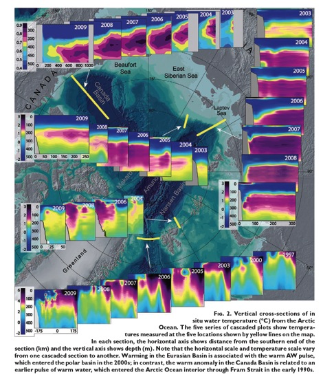
Water heated in the tropics is saltier and denser, and when transported into theArctic lurks 100 to 900 meters below the surface. That warm subsurface water can melt sea ice and undermine grounding points of submerged glaciers causing an acceleration of ice discharge. Intruding warm deep water also melts the underside of floating ice shelves, which also accelerates calving and ice discharge.
Instrumental records of Greenland’s air temperatures, also recorded the fastest rate of warming during the 1930s and 40s coinciding with increased inflows of warm Atlantic water. Accordingly intruding warm waters alsotransported more southerly fish species, prompting the birth of Greenland’s Cod fishery. CO2 driven models have completely failed to simulate this Arctic warming.
Simultaneously the best studied Greenland glacier, the Jakobshavn, began retreating from its Little Ice Age maximum with it fastest observed retreat of 500 meters per year between 1929 and 1942. The rapid retreat was amplified when the glacier’s terminal front became ungrounded from the ridge. That earlier grounding point had previously prevented warm subsurface waters from entering its fjord. With more warm water entering the fjord, the grounding point rapidly retreated.
When warm water intrusions subsided, the glacier stabilized, and even began advancing between 1985–2002. Although the recent retreat of Greenland’s glaciers is reported as an acceleration relative to the 70s, the rate of retreat is now much slower than the 30s and 40s. And again the 20th century pattern of retreat does not correlate with rising CO2 concentrations.
 |
| Warm Water Flow into the Irminger Current |
The 20th century pattern of Greenland’s melting glaciers correlates best with the timing and distribution of intruding warm Atlantic water. As seen in these illustrations, due to changes in the North Atlantic Oscillation in the 1990s, a sudden influx of warm Atlantic water entered the Irminger Current. The numbers here indicate that the current’s temperature cooled from 10°C to 1.5°C above freezing as it traveled along Greenland’s coast.
 |
| Lost Ice Mass from Grace satellite data |
As seen here from recent satellite estimates, the amount of Greenland’s lost continental ice, coincides with the warmth of the Irminger Current, with pinker areas representing the highest rates of lost ice.
Warm Atlantic waters that don’t enter the Irminger Current, continue deeper into the Arctic, mostly via the Barents Sea. Greater volumes of intruding warm water cause greater reductions of ice in the Barents and Kara Seas, deep inside the Arctic Circle. Danish Sea Ice records reveal a similar loss of sea ice during the 1930s rivaling the recent decline.
Coinciding with cycles of reduced sea ice, glaciers on the island Novaya Zemlyain the Barents Sea, also underwent their greatest retreat around 1920 to 1940. After several decades of stability, its tidewater glaciers began retreating again around the year 2000, but at a rate five times slower than the 1930s. The recent cycle of intruding warm Atlantic water is now waning and if solar flux remains low, we should expect Arctic sea ice in the Barents and Kara seas to begin a recovery and Arctic glaciers to stabilize within the next 15 years.
The contrasting behavior of Antarctic Ice is further confirmation that intruding warm water is a natural driver of melting polar ice. Unlike ice that melted deep inside the Arctic Circle, Antarctic Sea Ice has increased to record extent and expands far outside the Antarctic Circle. Why such polar opposites? Because Antarctica is shielded from intruding warm waters by a Circumpolar Current.
Antarctica’s Circumpolar Current consists of warm subtropical waters driven eastward by westerly winds. Because there are no continents to block its path or deflect those warm waters poleward, the Circumpolar Current simply encircles the continent. The one place where Antarctic sea ice has retreated slightly, only occurs along the western side of the Antarctic Peninsula where the Circumpolar Current makes its closest approach.
Likewise without intruding warm waters, Antarctica has lost far less continental ice than Greenland. Although Antarctica contains 14 times more ice than Greenland, Greenland has lost between 2 and 5 times more ice than Antarctica. Based on changes in gravity, most areas of Antarctica have slightly gained ice designated by greenish tones. However where warm waters and winds of the Circumpolar current approach the Peninsula, there has been moderate ice loss designated by bluish tones. And despite being Antarctica’s most poleward coastline, there has been a great loss of glacier ice around the Amundsen Sea, illustrated by redder tones, causing a net loss of ice for the continent.
 |
| Antarctic Basal Melt Hot Spots |
The reason for this concentrated melting is due to the upwelling of relatively warm Circumpolar Deep Water that lurks 300 feet below the surface. Glaciers along the Amundsen Sea terminate in deep water, and are most susceptible to periodic upwelling of that warmer deep water, which causes basal melting.
Maps pinpointing regions with the greatest basal melt, highlighted here by red dots, coincide with the greatest loss of glacier ice along the Amundsen Sea hot spot. Amundsen glaciers are grounded along the coastal shelf where ancient channels can direct warm, upwelled deep water directly to the base of the glaciers. Early explorers reported excessive crevasses and concave surfaces on these glaciers suggesting extreme basal melting was happening in 1950s, and was likely a process that has been ongoing on for millennia. Much like Greenland’s Jakobshavn glacier, once Amundsen’s glaciers retreated from their Highest ridge on the continental shelves, upwelled warm water could overflow the ridge and melt an increasingly larger cavity near the glaciers grounding points. In turn, a larger cavity allows even more warm water to enter. In contrast, the few Amundsen Sea glaciers with grounding points located beyond the reach of upwelled waters, those glaciers have not lost any ice.
Like the rhythm of retreating and advancing glaciers, rates of sea level rise have ebbed and flowed as seen in this graph from the IPCC. Again it is the 30s and 40s that experienced both the greatest retreat of glaciers and the fastest rise in global sea level. With the recent decline in solar flux and the shift to cool phases of ocean oscillations, natural climate change suggests that although glacier retreat and sea level rise will likely continue over the next few decades, the rates of sea level rise and glacier retreats will slow down.The next decade will provide the natural experiment to test the validity of competing hypotheses. Are changes in the earth’s ice driven by natural or CO2 driven climate change. I am betting on natural climate change.
 |
| Rates of Change in Sea Level |
Read more about natural climate change In Landscapes and Cycles: An Environmentalist’s Journey to Climate Skeptisicsm!
Subscribe to:
Posts (Atom)